In the realm of interior design, achieving harmony, balance, and aesthetic appeal within a space often feels like a daunting task. Whether you’re revamping your living room, bedroom, or any other area of your home, finding the right balance of colors, textures, and elements is crucial. Thankfully, there’s a simple yet effective guideline that can help you master the art of interior design effortlessly – the 60-30-10 rule.
At Superior View Window Fashion, we understand the significance of creating captivating and visually appealing spaces through our premium window treatment solutions. Today, we delve into the fundamentals of the 60-30-10 rule and how you can leverage it to transform your living spaces into stunning havens of style and sophistication.
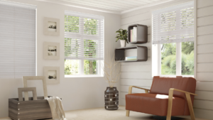
Image by Norman
Understanding the 60-30-10 Rule
The 60-30-10 rule serves as a guiding principle for achieving a well-balanced color scheme within any given space. Essentially, it suggests dividing the colors used in a room into three distinct percentages: 60%, 30%, and 10%. Each percentage corresponds to the proportion of colors utilized in different elements of the room – the dominant color, the secondary color, and the accent color, respectively.
- The Dominant Color (60%): The dominant color forms the foundation of your color scheme and occupies the largest portion of the space. Typically, this color is applied to the walls, floors, or large furniture pieces within the room. Its primary role is to establish a sense of cohesion and provide a backdrop for the rest of the design elements to shine.
For instance, if you opt for a neutral palette in your living room, shades of white, beige, or light gray can serve as excellent dominant colors. These hues create a versatile canvas that complements various decor styles while fostering a sense of openness and tranquility.
- The Secondary Color (30%): The secondary color works in tandem with the dominant color to add depth and visual interest to the space. It occupies a sizable portion of the room, appearing in elements such as upholstery, area rugs, draperies, or accent walls. This color serves as a bridge between the dominant and accent hues, tying the entire color scheme together harmoniously.
When selecting the secondary color, consider hues that complement the dominant shade while introducing contrast and personality. For instance, if your dominant color is a soothing blue, you might incorporate shades of navy, teal, or charcoal as secondary colors to infuse richness and sophistication into the design.
- The Accent Color (10%): The accent color injects vitality and personality into the room, serving as the focal point that commands attention. While occupying the smallest percentage of the color scheme, its strategic placement enhances visual impact and creates moments of intrigue throughout the space.
Accent colors can be introduced through accessories, artwork, throw pillows, or statement pieces such as window treatments. This is where Superior View Window Fashion excels, offering a myriad of options ranging from bold patterns and vibrant hues to luxurious textures and intricate designs. Whether you opt for custom draperies, Roman shades, or elegant blinds, our window treatments can serve as the perfect vehicle for incorporating your chosen accent color into the room.
Practical Applications of the 60-30-10 Rule in Window Treatments
Now that we’ve unraveled the essence of the 60-30-10 rule, let’s explore how you can apply this principle to elevate your home decor through exquisite window treatments:
- Harmonizing with Dominant Colors: When selecting window treatments, consider how they complement the dominant color of your space. If your walls are adorned in a soft shade of ivory or beige, opt for window coverings that echo these hues for a seamless integration. Our collection of sheer curtains, honeycomb shades, and roller blinds offers a spectrum of neutral tones that effortlessly blend with any dominant color palette.
- Amplifying with Secondary Colors: To accentuate the secondary color in your room, explore window treatment options that feature complementary shades or patterns. If your upholstery or accent walls boast a striking emerald green or deep plum, consider incorporating draperies or shades with subtle hints of these hues. This cohesive approach enhances visual continuity while infusing depth and dimension into the overall design scheme.
- Making a Statement with Accent Colors: For those craving a bold and dramatic flourish, leverage window treatments as a focal point to showcase your chosen accent color. Whether it’s a pair of vibrant red curtains, geometric-printed Roman shades, or intricately embroidered valances, our customizable solutions empower you to make a lasting impression with your window decor. By adhering to the 10% rule, these accent pieces add personality and flair to your space without overwhelming the senses.
Case Studies: Bringing the 60-30-10 Rule to Life To illustrate the transformative power of the 60-30-10 rule in action, let’s delve into two hypothetical case studies where Superior View Window Fashion collaborates with homeowners to curate breathtaking window treatments:
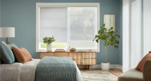
Image by Alta
Case Study 1: Contemporary Chic Living Room Client Brief:
A young couple seeks to revitalize their modern living room with a sleek and sophisticated color palette. Color Scheme: Dominant – Crisp White (60%), Secondary – Slate Gray (30%), Accent – Mustard Yellow (10%)
Solution: Our design experts recommend floor-to-ceiling draperies in a luxurious gray fabric, serving as the perfect secondary element to complement the white walls and minimalist furnishings. To infuse warmth and personality into the space, we introduce accent pillows and a striking mustard yellow accent chair. Finally, custom-made Roman shades in a subtle geometric pattern tie the entire color scheme together, adding visual interest without overpowering the contemporary aesthetic.
Case Study 2: Tranquil Bedroom Retreat Client Brief:
A busy professional seeks to create a serene sanctuary in their master bedroom, inspired by nature’s calming palette. Color Scheme: Dominant – Soft Beige (60%), Secondary – Serene Blue (30%), Accent – Sage Green (10%)
Solution: Our design team opts for floor-length curtains in a delicate blue fabric, echoing the tranquil hues of the nearby lake. These serve as the secondary color, complementing the neutral beige walls and inviting upholstered headboard. To introduce a touch of botanical charm, we recommend tailored valances in a subtle sage green print, evoking the serenity of a lush garden oasis. The result is a harmonious blend of colors that induces a sense of relaxation and rejuvenation every time the client enters their personal haven.
Conclusion: In the realm of interior design, achieving balance and harmony is paramount to creating spaces that exude style, comfort, and sophistication. The 60-30-10 rule serves as a timeless principle that empowers homeowners to curate cohesive color schemes with ease and confidence. By leveraging this rule in conjunction with our exquisite window treatment solutions at Superior View Window Fashion, you can transform your living spaces into stunning reflections of your unique taste and personality.
Whether you’re embarking on a full-scale home renovation or simply refreshing the decor of a single room, let the principles of the 60-30-10 rule guide you towards achieving the perfect equilibrium of colors, textures, and ambiance. With our unmatched expertise and unparalleled selection of window treatments, the possibilities for elevating your home decor are truly limitless. Experience the difference firsthand and embark on a journey of inspired design with Superior View Window Fashion today.
No Comments
Comments are closed.